 Professional Partner

Launching a new webflow website or redesigning an old one can be a daunting task.
There are numerous steps involved in the process and each step requires careful attention.
The last thing you want to happen is to launch a site that looks great but isn’t performing well.
How often do you launch a new site or redesign your existing one? If you’re looking for ways to improve your workflow, then you should stick around till the end of the post.
This article contains seven things to consider before launching your webflow site.
You would also get a website pre launch checklist at the end of this article.
This checklist helps you to ensure that your new site launches successfully. It covers important aspects such as design, SEO, social media marketing, email marketing, and analytics.
1. Responsive design:
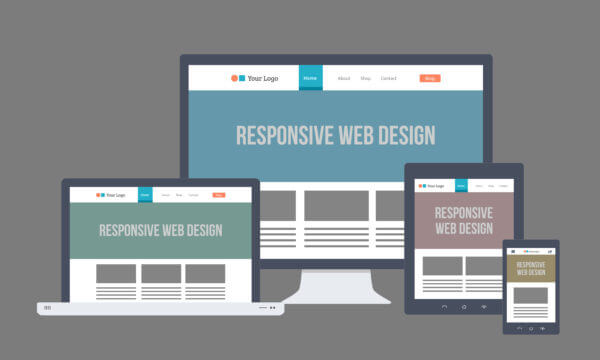
A responsive design can solve many problems for your website. The result is that your website will become mobile-friendly, look better on both large and small screen devices, and visitors will spend more time on your site. In addition, it can help you rank higher on search engines.
When a website is designed responsively, it will look great across all screen sizes and resolutions and will flow freely.
It also eliminates the need to maintain separate versions of your website for mobile and desktop, saving you time, resources, and effort.
A fast, mobile-friendly, and modern website is a prerequisite for launching your website..
It enhances your online presence and convinces your customers that you're trustworthy.
You can use a tool like WhatsMyScreenResolution to check the responsiveness of your webflow website across multiple devices.
There are different native webflow breakpoints you should watch out for before you launch your website;
- Large desktop (1920px - 1440px)
- Average desktop (1440px - 1279px)
- Tablet (1279px - 768px)
- Mobile landscape (768px - 568px)
- Mobile portrait (568px - 320px)
Webflow allows you to customise your site design for different screen sizes using its built-in responsive breakpoints known as media queries.
Here are some rules you should follow for organising breakpoints;
- Everything right of the desktop cascades down (tablet > mobile landscape > mobile portrait) and everything left of the desktop cascades up (1280px > 1440px > 1920px).
- The styles you override no longer inherit changes from desktop, tablet, or mobile landscape breakpoints since styles set on mobile portrait override styles inherited from tablet.
- A style set on 1920px overrides styles inherited from desktops, 1280px, and 1440px
- Changing the Styles panel is the only thing that cascades up or down. A change to the canvas or the element settings panel affects all breakpoints (the exception is editing the grid on canvas: this opens a popover in the Styles panel where you can directly manipulate on the canvas and changes cascade up and down as necessary).
- Elements that are deleted or reordered are affected on all breakpoints. The Style panel allows you to hide elements on devices by setting the display to "none".
All style changes made on the higher breakpoints will be inherited by the lower breakpoints.
You can change the values on any breakpoint to override these cascading styles.
If you set the width of a div block to 400px on desktop, it will remain as 400px on all breakpoints, unless you override styles on another breakpoint.
You can set different styles for different screens using breakpoints. With this method, you can customise the design for each screen without affecting other screens.
An element will get deleted in all breakpoint views if it is deleted on one breakpoint view. By setting the display layout to none, you can hide elements at different breakpoints to create different layouts.
You can switch between different breakpoints using the device icons in the top bar of Designer when in design mode or preview mode.
2. Styleguide:
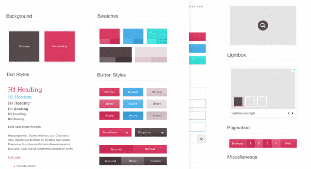
You should have a style guide for your website to make sure that your brand identity is clear, recognizable, and recognizable.
Style guides define methods for maintaining a brand's identity, so it's vital to spend time and resources on getting it right.
In summary, a style guide helps to ensure a continuous brand experience throughout your website. It ensures that no matter how, when or where a customer visits your website, they are experiencing the same styling. It’s this consistency across every touch-point that helps build a brand and brand loyalty.
Here is a list of elements you should consider to ensure your style guide in order before launching your website.
- Global Heading Tag: The heading tags in a webpage are used to tell the browser how to display content. This is why and how they organise your content into a readable format.
- Rich Text: Rich Text elements have custom spacing and styling
- Global Colours: Colour plays an important role in helping visitors navigate through the site, helping them find what they are looking for easily and quickly. It also assists in building a hierarchy of information, focusing attention on the most important information and calls to action.
- Global Margin and Padding Classes: This should be set to ensure consistency sitewide.
- Max width Classes: Global classes are updated after checking what kind of Max Width Classes are used in Development.
- Navigation and Footer Symbols
- Fonts: Fonts and Typography establishes a strong visual hierarchy, provides a graphic balance to the website, and sets the overall tone for the product. To ensure an excellent user experience, typography should guide and inform your users, optimise readability and accessibility. You should upload your fonts using the WOFF format.
3. UI/UX + Designs

The User Interface (UI) design process refers to improving user interactions with an app or website so that it is as effective and robust as possible.
The User Experience (UX) is a process of creating and improving the quality of the experience users have when visiting a website or app. A website's user experience can either make it a success or a failure.
In short, a good UI/UX design means more user engagement, more user engagement turns into potential leads, ultimately increasing the revenue, as well as the brand awareness of your business.
A good UI/UX design results in increased user engagement, and increased engagement leads to more potential leads, which will increase revenue as well as your brand awareness.
Before launching your webflow website, you need to look out for the following:
- The hover state: It should be applied to all links, all buttons, all clickable cards. Hover states cannot be applied to elements that cannot be clicked.
- Interaction Speed: Websites should be designed such that users can interact with the site without being impeded by interactions.
- Missing Content: Double check for places where they are missing contents.
- Blurry Images: Make sure images are not blurry on all devices.
- Images Height: Ensure that images aren't set to 100% height. Make sure they always
- Logo Alt Text: Add an alt to your logo image to ensure readability for screen readers.
- Logo Size: Ensure that your logo maintains a consistent size across the website.
4. SEO
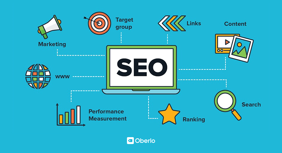
Search Engine Optimization (SEO) is the practice of increasing the quantity and quality of organic traffic to your website.
The higher your brand's ranking when someone searches a term in your industry, the more visible your brand online. As a result, you have more chances of converting qualified prospects into customers.
Using SEO properly can help your brand stand out among competitors and improve the user's experience with your brand and website.
- Heading 1: You should not have more than one heading 1 on any page structure. By utilising keywords in your H1 tags, you help search engines understand what your page is about.
The user can see at a glance what the page is all about by looking at the H1 tag. The rest of the headings provide a big hint to users as to what to expect in each section.
- SEO and Tile Description: All pages on your website should have an SEO Title and description. Make sure all of your website's images have a descriptive alt text so that visitors as well as search engines can access your content.
- Image Alt texts: Alt text improves accessibility by describing what an image is showing to visitors who cannot see it. It also aids search engine crawlers, so it improves SEO. When you fail to set alt attributes for your images, your website becomes difficult for screen readers and browsers to interpret, which reduces the user experience for people with visual impairments.
- Schema Markup: The schema markup creates a rich snippet of text that appears in search results.
- Redirects: When a visitor clicks on a link and is faced with a 404 error page, this will negatively affect their experience of the site and may lead them to leave. By implementing 301 redirects, visitors will be able to easily navigate the site and engage with content that might eventually turn them into a customer or follower.
You can use SemRush’s SEO Site audit tool to measure your website metrics and how you can improve them.
5. Forms
Web forms are frequently used for communication between a company & a user and also to gather leads.
Some of the form attributes you should look out for
- Input Settings: The default input settings for forms.
- Form Settings: Configure the form so that it either goes to the client's email address or their CRM.
- Form success Message: Each form should have a success message for every successful form submission.
- Form Error Message: Each form should have an error message for every unsuccessful form submission.
- CRM Connection: you can either send the form to your e-mail or their CRM of choice.
6. CMS Pages
The Webflow CMS gives you full control over your content structure and how this content is designed throughout your project—all without touching a line of code.
The CMS is how webflow controls and works with users' dynamic content.
Here what to check out for on CMS Pages;
- CMS Slugs: These are slugs for the singular CMS Pages, e.g /blog/ , /author/,
- CMS Fields: The CMS fields should always include a description which describes what they do, as well as what they're connected to.
- Dummy CMS Content: Each CMS should have at least 3 items with different content added, ideally, we should have a total of 7 items.
- CMS Connection:
- Conditional Visibility: CMS elements should be hidden if the data is empty.
- Dynamic SEO Titles, Descriptions and OG Images: There are two major ways to go about this. You can either pull the SEO title from the Item name + " | Business Name" or create custom fields for each.
7. Project Settings
Project settings allow you to adjust project-wide attributes and custom code.
- Favicon and Web Clip: Upload your own favicon and web clip
- Language Code: Go to project settings and add the language code.
- Remove Webflow Branding: Delete the Webflow badge on the bottom right and disable the branding in the code
- Timezone: Make sure the timezone is set with your timezone.
- Advanced Publishing Options: Use secure frames, minify HTML, CSS, and JS
8. Browsers
It is important to check compatibility with your website.
A web browser is not the same as another. Though many of the popular choices are similar, they are still different enough from one another that they will not necessarily display your website the same way.
The importance of testing a website in different browsers cannot be overstated.
You probably have a favourite browser – most people do – and chances are you always use it to work on your website.
Chrome has by far the largest market share, so it's the most likely option. Nevertheless, Firefox, Safari, and Internet Explorer remain popular.
Spending a lot of time on your favourite browser can make you forget that all of these browsers don't function the same.
Despite their similarity in functionality, most of them are coded differently and offer different features.
This means that one website may not always work or display the same way across all browsers. In contrast, if you've only used Chrome and switch to Firefox or Safari, you'll notice the differences.
Your layout may not look quite right, and some features may not work properly.
By testing your website in various browsers - preferably the most popular ones - you can easily avoid this problem.
There are a lot of resources and tools that can help you get started, since this is such an important task.
One of the most popular tools for cross-browser testing is Browserling.
It ensures that you are able to view your website across multiple devices to test for it’s responsiveness.
Conclusion
When building a webflow website for yourself or for a client, it is essential that you follow the checklist to ensure that nothing goes wrong after launching the website.
You do not want to have to make major changes to a website you just launched, so it is best to avoid all the pitfalls beforehand.
If you need any help with launching your webflow website, feel free to reach out to us.
We offer Webflow web design services to help business owners increase conversions, sales and much more.
Get in touch with us today and we'll more than happily provide a free video site audit that explains the current state of your website as well as practical tips + resources to improve.
.webp)
.webp)
Let's talk about your next project.
From highly interactive websites, or micro-sites, to Figma > Webflow development projects, we’ve got you covered - our team of Webflow experts are here to help.


